For the UCverse web site, I was the lead experience designer during my summer internship at the UC Office of the President. I was fortunate to work with another designer who had more experience in graphic design. We began the interface work by identifying types of users and interviewing people who represented those types. Once we had a good sampling, we made a set of personas. Following is one example persona.
Beth Nunally, info retriever (age 34)
Beth works at the Doe Library at UC Berkeley. She loves her job as a librarian because she gets to learn something new every day. In college, she had a hard time picking a major because she was interested in everything. Though she opted for library science in the end, she maintains an interest in earth science and is very interested in the potential consequences of global warming. Her understanding of atmospheric science and terminology is about equal to what one would get in a modern freshman earth science course. Beth has a boyfriend who is an aspiring actor, serious and good enough to get occasional paid jobs. She enjoys filling him in on scientific information when he plays a role that requires it, or helping him figure out how to send an email with an attachment. In fact, she always enjoys helping people find the information they want. One of her favorite things about working at the library is that she gets random questions from patrons and she has a great time tracking down the answers. Some of the requests don’t spark her curiosity in particular, but she always enjoys the hunt. When she isn’t tracking down information for patrons, she is trying to improve the organization of the library, checking to see what other libraries are doing that might be a good idea.
Goals
To keep library patrons happy
To satisfy her own curiosity
To keep informed about what other libraries in the UC system and beyond are doing
To keep learning about library science in the digital age
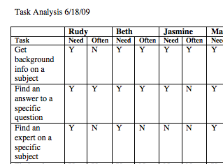
Next, we did a task analysis, to determine which features were needed. Following is a bit of the resulting table.
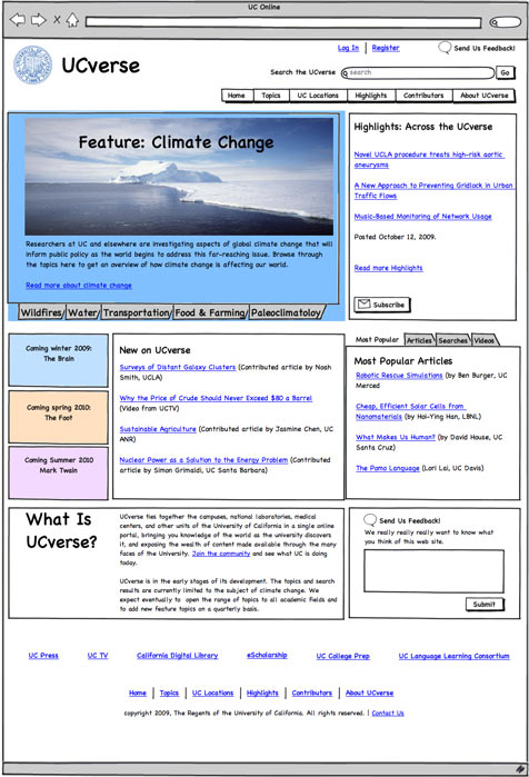
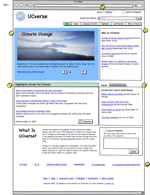
We next wrote scenarios and used those to each develop an initial design for the entire site. We used a parallel design process to generate as many good ideas at the outset as possible and then joined them into a single consensus design. We used Balsamiq Mockups for the design work and also for making paper prototypes. Here is what the first consensus mockup for the home page looked like.
We made five different mockup versions of the site and tested them as paper prototypes with potential users. Next, we put together a set of wireframes. We used the latest mockups and added extensive annotations in a Word file.
The annotations read something like this:
Notes for Wireframes
August 7, 2009
Numbers highlighted in yellow refer to callouts on mockups
Page 1 (Home page)
1. Area in blue represents a changing display of current and upcoming high-level topics. Image and text change on a rotating basis through a small set of options. The image and text link should be linked to the topic page for the topic currently shown. The first dot is black when the first image is shown; the second is black when the second image is shown; etc. The user can click a dot or use the left or right arrow to move from one dot to the next. Once the user clicks a dot or an arrow, the rotation stops.
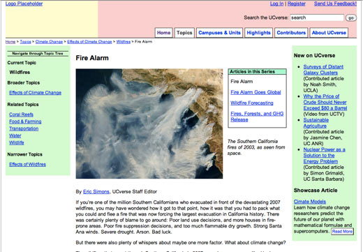
Then, we built the first front-end prototype with HTML and CSS. This is what I delivered at the end of my summer internship. Here's a sample page from that.