-

Design Notes: I experimented with a bunch of pictographic logos that involved the word ischool and then realized that the i alone conveyed the idea of information. I decided to go with the look of an information kiosk sign, with its connotation of offering expertise to help people. I used the official Cal blue but not the gold, since the blue and white contrast had more the look of a kiosk sign. I used Monaco for the i, and overlayed a custom grid on top of it to make it look computer generated but intentional. (Merely pixellating it just looked like a low-resolution icon used by mistake.) Rounding the dot of the i added a human look and also helped the logo scale nicely to small sizes. The font for the school name is ITC New Baskerville—a modern take on a classic typeface. It seemed appropriate because the ischool itself is a modern take on a classic subject. To add dimensionality for the look of real-life signage, I added a drop shadow on the i sign.
-

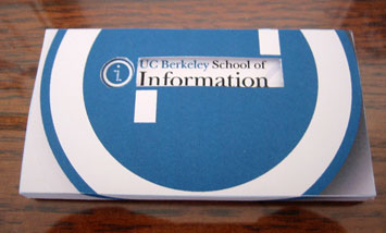
Design Notes: For a print media exercise, I created a business card holder and business cards that go with it. I decided to make a set that works together. The holder makes it easy to push out a single card at a time. It also reveals a little of the content of the cards. There are two cutouts that reveal the two parts of my ischool logo. The holes alone also form an i. Since there is an i inside the circular part of the logo, I used an oversized version of that part of the logo to give context to the i. That meant using the logo big enough to wrap around, which turned out to be a nice effect. The holder has a slot on one end, and if you run your finger along the rectangular cutout to slide a card, it comes out the slot. The box has a little ramp on the slot end, so that cards will continue to slide out as they dwindle in number.
-
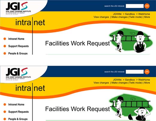
Design Notes:To make a work request form more interesting for users, I decided to incorporate a little fun into the header. When users call up the blank form, they see a version like the one just below. The "thank you" response page shows a slightly different version of the header. Clicking through in a browser gives it a flip-book style animation. (These were used with permission from the facilities team.) The caricatures are my own handiwork.
-
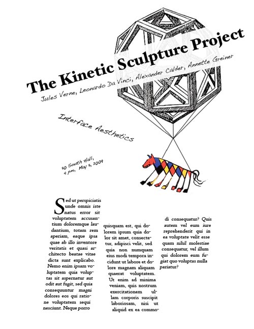
Design Notes: The sculpture image here is a combination of one of Da Vinci’s polyhedrons and Calder’s “Beastie.” I chose to use a handwriting-style typeface called Dakota along with Hoefler Text. In this series, I tried to figure out a way to make the sculpture seem to be floating in the air somehow.
This was my freestyle version of the poster. I decided to just let things get off the grid all over the place. I built it with the grid, but then I skewed things off of it to get them off kilter. I was aiming for a bit of expressionism.
-
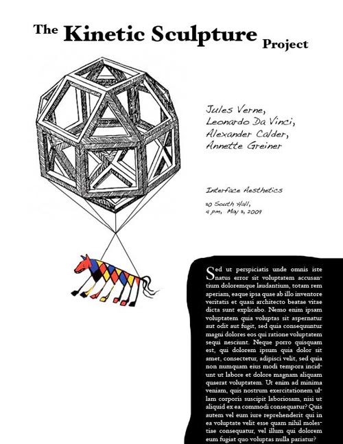
Design Notes: In experimenting with inverting black and white, I played with reversals on every area of the page but found myself concentrating on the paragraph area. Reversing out the area around the paragraph surprised me. It really opened up the layout, so that the names and class info suddenly had a lot of breathing room. It’s amazing that you can *add* a huge area of contrast to a layout and end up with what feels like more white space. Juxtaposing the sculpture image with the paragraph of text gives the illusion that the sculpture image is jumping off the text block.
-

For a design fix-up exercise, I redesigned the iSchool home page, introducing the new logo I created. Besides adding the logo, I simplified the page and tried to make a clearer visual hierarchy. To begin, I removed the odd shadowed borders of the original and continued the filmstrip across all the way to the edge of the page. Next I removed the background color on one column that didn’t deserve such visual weight. The four-column design became a three-column one, and the event and news images moved beside their explaining text to prevent confusion about which goes with which. I increased the font size and spacing on the main navigation and changed the disclosure carets into solid triangles. Less important links formerly at the top moved to the footer. For the “media center”, I made most of the text blue rather than red and left-aligned the text.